Rid us of dull corporate apparel!

Branded clothing is a really big thing in technology companies in general. Silicon Valley startups are perpetually giving out "swag" to customers, ranging from all sorts of utility items such as keychains, pens, mugs and coolers, stickers to put on our laptops, and – most importantly – clothing.
Clothes have moved far beyond their utilitarian function of covering our bodies to keep us warm and dry. They affect the way we see ourselves, and how others see us. They exude our personality, represent our social status and can be used to show off personal wealth and our sense of taste. Our clothes present our individuality and stand out from the crowd, or merely blend in and not be noticed.
So it's perpetually disappointing to me how dull typical corporate clothing is. Silicon Valley and the tech community in general is overflowing with monochrome, extra large and floppy, poorly fitting polo shirts embossed with a company logo on the chest or sleeve, perhaps with some more geek speak above or below. Calling this clothing 'conservative' – and conservatism is the enemy of startup marketing - is an understatement.
Dull logo shirts embossed with tech company names says I'm frugal so wear freebies, I work in tech because it says "Zingo" or "Yellowbrick Data" or some other company nobody outside of the valley monoculture has heard of, it says I don't mind being a walking advert for something uninteresting to most, I love vanilla ice cream and one of my favourite past times is to read Jane Austen novels while sitting on the toilet. Googly, Facebooky shirts, to me says that perhaps I'm just one of tens of thousands of others who decided to take a comfortable, low risk, conservative and safe job. My favourite vegetable is a potato, and my idea of a night out is going and getting boba. Nothing wrong with either of them, per se, but it's not enough to make someone ask "Google, tell me about that?"
We want to make designs that encourage questions, stand out from the crowd, and will have someone sitting nearby ask a question or two instead of doomscrolling their phone. Things that look like H&M shirts with a logo printed on the side doesn't get us what we need in startup marketing.
In startup marketing, we need to show that our company, our employees and our customers take risk, think differently and that by doing so they stand out from the crowd. These amazing people are the trailblazers; they are the people who risked their reputation to work at a startup or bring new technology into their enterprise. They bet their careers on new, unproven, buggy startup technology with the potential let them ace their KPIs and get promoted. They are the heroes who took the leap and then thrived, with no regrets. They are our Yellowbrick Heroes.
I personally found this disconnect between the 'what do we want our corporate attire to say' and the crappy clothes that start-ups produce, day in and day out, to be intolerable. At Yellowbrick we needed to do something different for our customers and employees, to let our heroes stand out from the crowd
Yellowbrick Heroes
Great T-shirts start with great art. I've been fortunate to know a number of creative types over the years, so we started a collaboration with Dominic Johnson-Hill at Plastered to both produce amazing art and turn it into top quality, beautiful apparel. Dominic started the first expatriate fashion brand in China and is a well known entrepreneur, motivational speaker and TV personality. Dominic works to produce artwork for the likes of Shake Shack, Hilton Hotels and other brilliant brands.
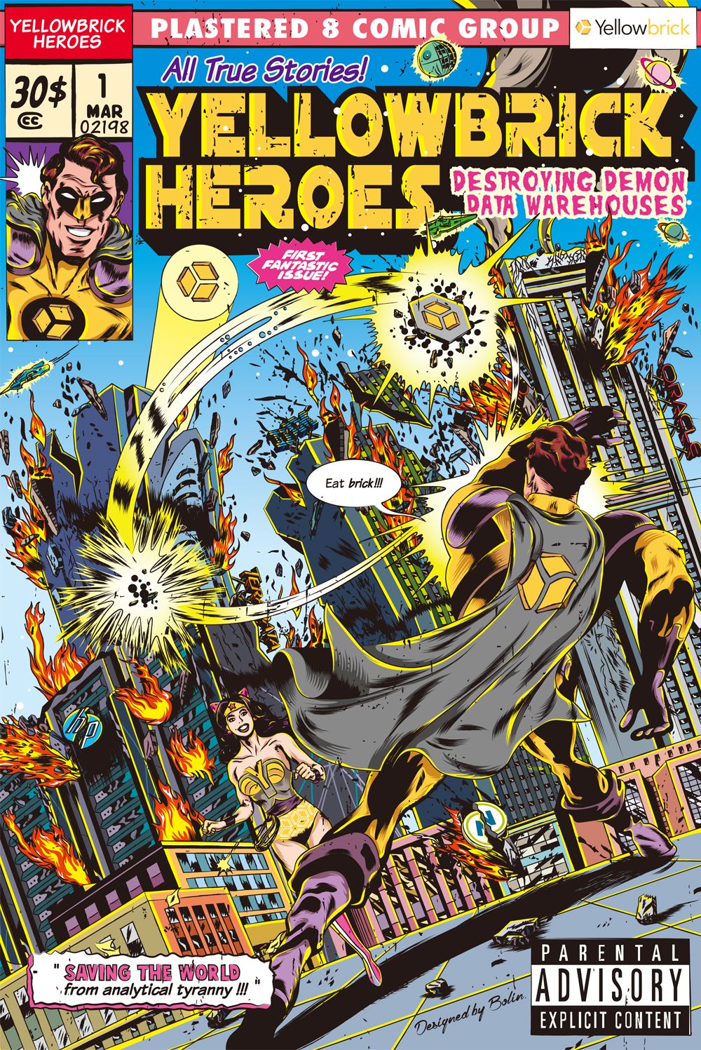
Dominic introduced us to up-and-coming comic book artist Li Bo Lin to produce a branded piece of artwork that would be ideal for our early adopter customers. Back then, our business was primarily won by replacing legacy on-premises systems from the likes of IBM, Teradata, Oracle and others. We wanted to find a way to create a layered design for a T-shirt for our customers: At first glance, it would stand out as something unique and interesting, make the wearer feel they are walking around in something rare and special, and that's worth talking about; upon discussion, the details of the design would allow the wearer to talk a bit about our business and value proposition.
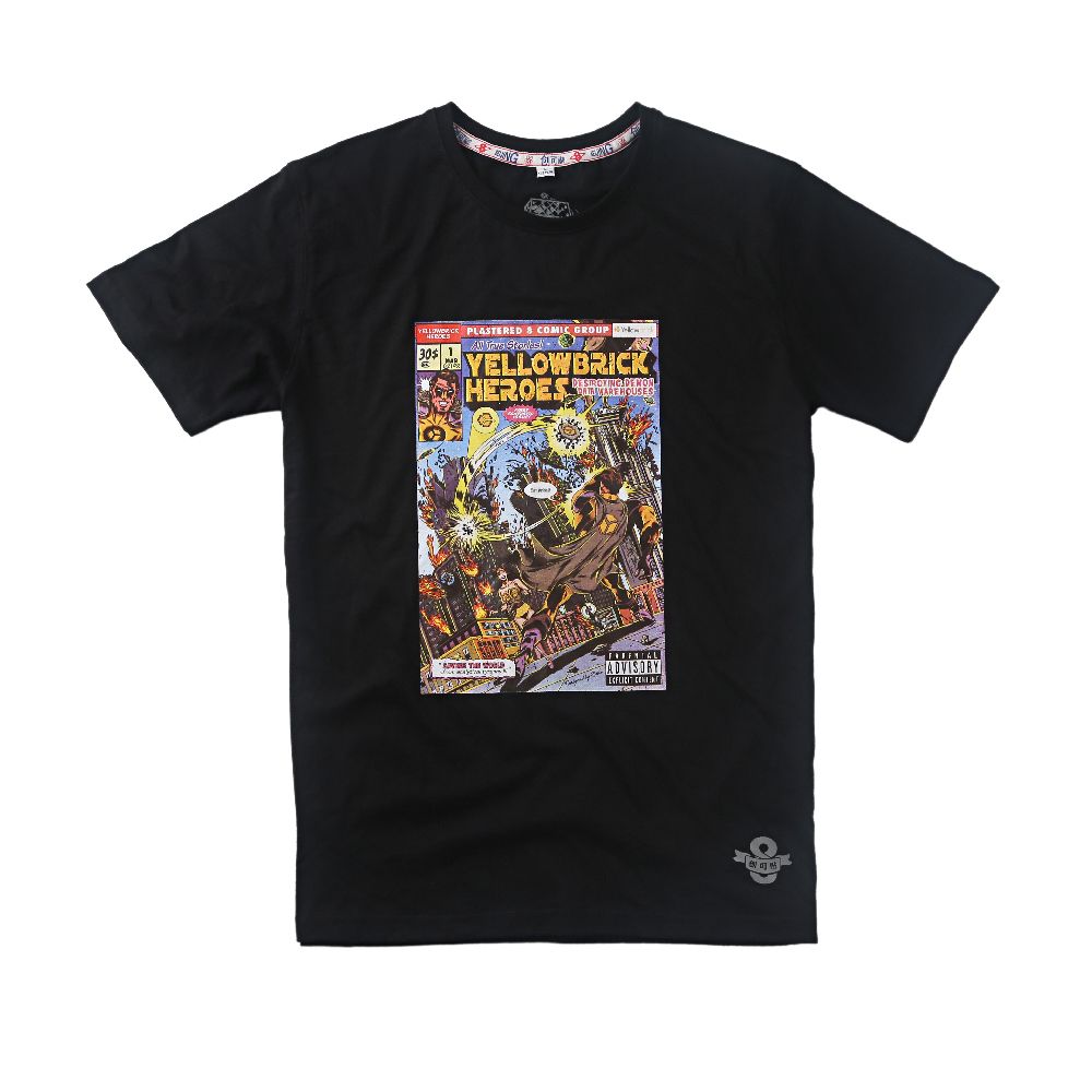
The result is here and shown below.


The first thing the viewer will note, is that it's a seriously cool looking T-shirt with a lot going on. Mot many people walk around in cool comic book shirts, so it's frequent for employees, customers and friends of the company who wear this thing to be told "wow, that's a really cool T-shirt, where did you get it?" - which opens up for a more detailed discussion. Some others are more frank - "that's the best damn corporate T-shirt I've ever seen!" When looking at the details on the real thing, we see our Yellowbrick heroes smashing up buildings, comic-book style. Upon closer inspection the buildings are actually racks of old data warehouse products which gives the opportunity to tell a story. There's some crazy fun stuff on there too - the odd batman sign, a death star and some crashing & burning legacy vendor logos.
The graphic is multi-layer screen printed onto high quality 190 gram cotton for the black shirt, 160 gram cotton for the green... the T-shirts will last well and the dyes involved are top quality with minimal fade – substantially higher quality shirts than the typical shop-purchased tee, because crap quality swag is worse than no swag. Giving out pens that break or stop writing is worse than giving out no pens... you don't want to be remembered for poor quality.
These shirts have some special details, logos and even a stitched fabric band around the collar. Overall, they generate a lot of positive comments and attention and give an opportunity to talk a bit about Yellowbrick – and most importantly they make our heroes cool and special! If any Yellowbrick customers who haven't received a shirt would like one, please send me an e-mail to neil@yellowbrick.com and we will sort something out.
Relax with Yellowbrick
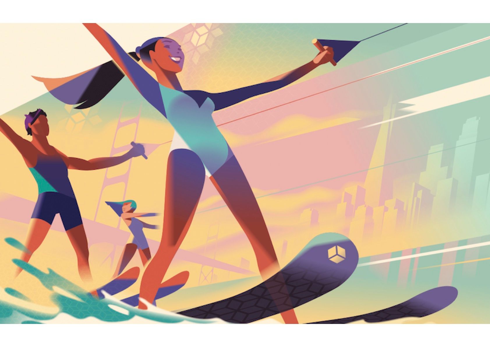
When we moved into our new office, we were in the middle of a manic, intense cycle of development and sales growth. All of our staff had a tough prior year, and we wanted to do something to set the mood in our pre-covid lunch and cafeteria area. We collaborated with Plastered and well known Art Deco illustrator Mads Berg to produce a giant mural that's very loosely associated with Yellowbrick. Mads' designs are inspired by vintage posters but with more modern styling, and have been associated with amazing brands like Coca Cola, Lego, Fairmont Hotels, Orangina, Wired and many theme parks and zoos.

To lighten the mood in the place, we wanted to show people relaxing with just a hint of Yellowbrick - our logo tessellated in the background, the San Francisco skyline and Golden Gate Bridge (our company started in the San Francisco Bay Area) giving interesting things to talk about, but without it being an obvious company ad. We're now in the process of turning this into some beautiful summer beachwear - over-sized T-shirts and towels - as gifts for employees, customers and friends of the company.
Overall feeling
I hope this can inspire some other technology companies to do produce some corporate attire that's great to look at, regardless of whichever business it's on behalf of. There's so much opportunity to do things that stand out from the crowd, not just comic books or art deco posters, that'll help promote business better, strike up conversations, and brighten up the streets of Palo Alto.
Honestly, at Yellowbrick we've insufficiently promoted and leveraged our cool designs to anywhere near the degree we should have done, and that's a key area of the organisation I'm working on and looking to improve: Our brand just isn't as well known as it should be, given our massive customer momentum and 2x year-on-year growth... That'll be the subject of another blog later!
